Last month ends the same way for a lot of people. You open one banking app, then another, then a credit card app, and finally a spreadsheet or notes file, just to answer a simple question like, "How much did I spend on restaurants?"
That's the core problem a personal finance dashboard solves. It's not about having more data, it's about getting one clear view fast enough that you can still do something useful with it. A good dashboard turns scattered transactions, balances, and goals into a picture you can read in seconds instead of an hour.
If you've ever wanted one place to see what's happening with your money, this matters even more in real life. A public Power BI example for India shows how a dashboard can pull together ₹5.93 lakh income, ₹4.94 lakh expenses, ₹99,000 savings, and ₹3.25 lakh net worth into a single year view, with major spending in rent, EMIs, and groceries, and savings held in mutual funds and FDs, all while supporting year-wise analysis from 2018 to 2021 Kaggle example. That's the basic promise: fewer scattered screens, more clarity.
If you want a simple companion while you think about what to track each month, this monthly bill tracker guide is a useful side read.
The End-of-Month Moment a Dashboard Solves
The stressful part at month-end usually isn't the money itself. It's the scramble. You know the rent went out, a few subscriptions renewed, and you ate out more than you meant to, but the numbers are split across apps and memory, so the answer stays fuzzy.
A personal finance dashboard solves that by gathering the pieces into one place. Instead of checking balances in one tab, card charges in another, and savings in a spreadsheet, you get one screen that shows what came in, what went out, and what changed.
That matters because most money questions are simple when the data is visible. Did groceries rise this month, or did a one-off expense throw things off? Is cash flow tight because income dipped, or because recurring charges grew? A dashboard helps you answer those questions without rebuilding the month from scratch.
A useful way to think about it is the same way you'd use a store flyer before a sale. If you're comparing household spending habits with purchase timing, a guide like When is Sale Debenhams guide shows how people look for the right moment before they commit. A dashboard gives you that same kind of timing awareness for your money, except the goal is not a bargain, it's a clearer decision.
What it helps you do
- See the month at a glance. You don't need to hunt through every account just to know whether you're ahead or behind.
- Spot the category that moved. Restaurants, groceries, rent, and debt payments stop being vague and become visible patterns.
- Separate feelings from facts. The dashboard does the counting so you can stop guessing.
A good first dashboard doesn't need to be fancy. It just needs to answer the questions you ask most often, quickly and consistently.
What a Personal Finance Dashboard Actually Is
A car dashboard doesn't drive the car. It tells you speed, fuel, and whether a warning light is on, so you can react before the trip goes wrong. A personal finance dashboard works the same way for money, it shows the signals you need without making you dig through every detail.
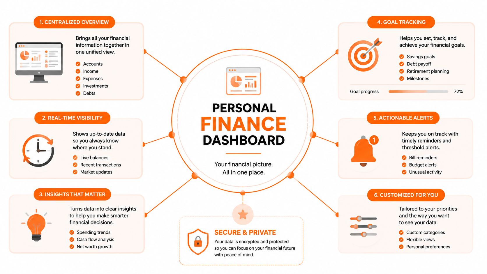
At the simplest level, it pulls together accounts, transactions, budgets, goals, and insights. Some dashboards connect directly to bank and card accounts, while others let you add entries manually. Either way, the point is the same, one place where your money becomes readable.
A strong dashboard usually has a few building blocks:
- Accounts, so you can see checking, credit card, investment, and loan balances in one place.
- Transactions, so every purchase, bill, and transfer has a home.
- Budgets, so you can compare what you meant to spend with what happened.
- Goals, so saving for a trip, emergency fund, or debt payoff feels concrete.
- Insights, so the screen doesn't just report numbers, it helps you notice patterns.
Practical rule: if a dashboard can't show balances, spending, and progress together, it's a report, not a dashboard.
For a beginner, the easiest mental model is this. The dashboard is the front window, the accounts are the raw material, and the insights are the part that tells you what deserves attention today.
A concise build example from the best net worth tracker app guide fits that model well, because net worth only becomes useful when it sits beside the other live money signals instead of floating alone as a number.
The Core KPIs Every Dashboard Should Show
A dashboard earns its place on the screen when it helps you decide what to do next, instead of just listing last night's transactions. For that reason, the strongest dashboards focus on a small set of core KPIs that answer practical money questions quickly.
A useful set includes cash inflow, cash outflow, savings rate, net worth, spending by category, and budget vs. actual. Together, they show whether money is arriving on schedule, where it is going, and whether your household is moving forward or slipping behind.
| KPI | Question it answers | Time horizon |
|---|---|---|
| Cash inflow | What money came in? | This month |
| Cash outflow | What money went out? | This month |
| Savings rate | How much did I keep? | This month and trend |
| Net worth | What do I own minus what do I owe? | Long term |
| Spending by category | Where did it go? | This month |
| Budget vs. actual | Did I stay on plan? | This month |
Start with cash inflow and cash outflow. They give you the short story of your money, like a kitchen sink with the tap and drain both visible. If paycheques, freelance income, or transfers from savings are coming in, and bills, card payments, and subscriptions are leaving faster than expected, the pressure shows up right away.
Savings rate adds a second layer. It answers a simple question, how much of what came in stayed in the account instead of disappearing into spending. Net worth gives the longer view, because it shows what you own minus what you owe, so a growing savings balance or a shrinking loan balance appears in the numbers.
A household with steady pay can still feel off track if fixed costs keep rising. That is why spending by category matters, because rent, groceries, transit, dining out, and family costs rarely behave the same way. Budget vs. actual shows the gap in plain language, so you can see whether the problem was one surprise bill, a few small extras, or a pattern that needs attention.
For beginners, the point is not to chase more charts. It is to keep the screen honest. If a dashboard shows all six KPIs clearly, it can be more helpful than a tool packed with extras nobody checks, and a careful comparison in this net worth tracker app guide shows why a clean view often matters more than a crowded one.
Canada-specific account details matter here too. A useful dashboard should handle chequing accounts, credit cards, savings, loans, and investments without making a transfer between accounts look like new spending. It should also keep registered accounts readable, so RRSP, TFSA, and other account types do not get lumped together in a way that hides what is available for bills, emergencies, or long-term goals.
The same idea applies to data accuracy. If a dashboard mislabels a refund as income, misses a credit card payment, or delays an update, the KPIs stop being dependable. Good dashboards do not just display numbers, they keep the numbers believable enough that you can base a rent decision, grocery plan, or debt payment on them with confidence.
For a broader comparison mindset, see how Gold IRA Association rates them at see how Gold IRA Association rates them.
How to Evaluate a Personal Finance Dashboard for Real Life
A lot of dashboards look impressive until you try to use them on a normal Tuesday. The better test is not how many charts they show, it's whether they fit the way you manage money.
Start with the main view. Can you understand your month in one glance, or do you need to click through four layers just to find spending? If the opening screen hides the answer, the design is working against you.
Then check account variety. A freelancer with mixed income needs a dashboard that handles bank accounts, credit cards, and possibly savings or investment accounts. A couple sharing rent and groceries needs a view that doesn't collapse once two people's spending gets mixed together.
You should also look at automation level. Some tools import transactions automatically, which is convenient, but they still need good categorisation and timely updates. Others rely more on manual entry, which takes longer but can be easier to trust when data feeds are messy.
A dashboard that saves you time but forces constant cleanup is only half-helpful.
The fourth filter is household support. Shared budgets, joint bills, and recurring family costs are common enough that a dashboard should handle them without turning every transfer into a puzzle. The fifth is insight quality. A strong tool spots subscriptions, duplicate charges, and unusual spending instead of just storing transactions.
For a broader comparison mindset, it can help to see how Gold IRA Association rates them, not because you need that exact topic, but because the evaluation habit is similar. You're not asking, “Does this tool have features?” You're asking, “Does it help me make a better call with less friction?”
Before you choose anything, ask yourself these questions:
- Can I understand the main screen quickly?
- Does it work with my account mix?
- Will the data stay fresh enough to trust?
- Can I manage shared money without confusion?
- Does it help me catch waste, not just record it?
If the answer is mostly yes, you're probably looking at a dashboard that can survive real life, not just demo mode.
Privacy, Security, and Integration Trade-offs Worth Knowing
A personal finance dashboard can look polished and still give you shaky numbers if the account connections are weak. That is why the bank-sync question makes so many people pause. Automatic connections are convenient, but they rely on third-party aggregators, and those feeds can lag, miss transactions, or label spending in the wrong category. If you are trying to follow your month from payday to bill day, a half-updated timeline can hide the very pattern you wanted to see.
Manual entry moves more slowly, but it gives you more control over what enters the system. You decide what counts, you notice mistakes sooner, and you are not depending on every feed to behave perfectly. For privacy-focused users, that trade-off can strengthen the tool.
Canadian account mixes make the choice more complicated. TFSAs, RRSPs, joint accounts, credit cards, and different bank connections do not always line up neatly in a US-first tool, so the dashboard has to deal with real household accounts instead of assuming one tidy data source. If it cannot reconcile those accounts into one timeline, the screen may look organized while the underlying picture stays off.
A technical example of the better architecture is a decoupled client-server design, where the interface shows summaries locally while the backend handles storage and validation. FinanceHub's repository reflects that kind of split, and it is a sensible pattern because it keeps the screen responsive while protecting the data layer.
Trust test: if a tool cannot clearly explain how it protects credentials, lets you export your data, or handles broken connections, keep looking.
The same caution applies to integrations more broadly. A founder's guide to system integrations is useful reading because it shows how much depends on the quality of the connection, not just the feature name. Personal finance works the same way. A dashboard with fewer bells and whistles can be the better fit if it matches your comfort level, your accounts, and the way your household moves money.
One more thing to watch, some tools keep only limited history, and that makes long-term pattern-spotting harder. If you care about trends, not just today's balance, history matters as much as convenience. The same is true for bank account aggregation, because the shortest path to an attractive dashboard is not always the safest path for accurate records.
A Practical Setup Workflow You Can Follow This Week
The easiest way to start is to keep the first version small. Don't try to model your entire financial life on day one. Start with the accounts you check most often, because those will give you the fastest feedback.
Use this order:
- Add your main checking account first. That tells you what money is available right now.
- Add your primary credit card next. That makes spending visible before the statement arrives.
- Add one savings or investment account. This gives you a first read on progress, not just spending.
- Set one baseline month. Pick a month to compare against so your dashboard has a reference point.
- Create one or two simple budgets. Keep them narrow, like groceries and dining out, so you can watch them.
- Choose one savings goal. Emergency fund, travel, or debt payoff all work if the target is clear.
- Schedule a weekly review. A short habit beats a perfect setup that you never open again.
For Canadians with accounts that don't sync reliably, manual entry is still a solid option. It can feel less automatic, but it also lets you track accounts on your terms, especially if you care more about accuracy and privacy than convenience alone.
A 10-minute Friday check-in is enough for most beginners. Scan balances, confirm recent transactions, and note anything unusual. Then do a longer month-end review, about 30 minutes, to compare the month against your baseline and adjust your budgets before the next cycle starts.
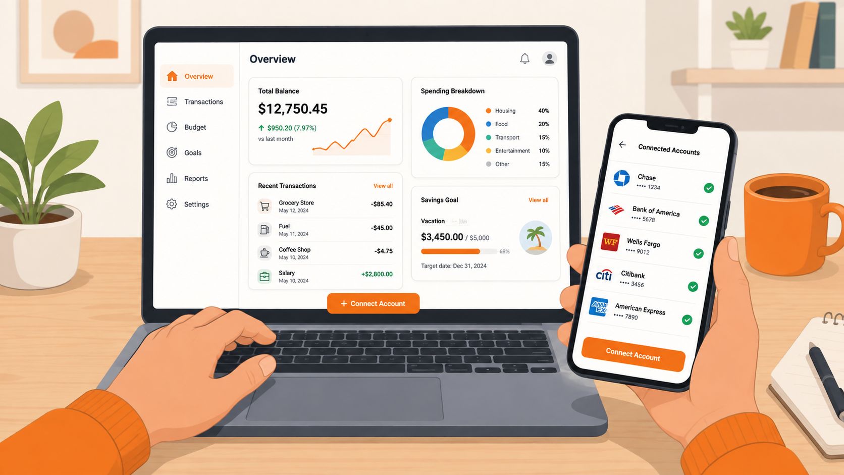
A clean rhythm helps more than a perfect system. In one week, you should be able to see your accounts and confirm your first few categories. In one month, you should know where your money goes and what needs to change.
Where Fintrack Fits and Your Starter Checklist
Fintrack brings the same core pieces together in one place, income, expenses, budgets, and goals, so you're not piecing together a month from separate apps. It also supports household planning, which matters when more than one person shares the bills, and it includes a Benefits Wallet for noticing hidden value like cashback, unused credits, loyalty points, discounts, and expiring offers.
The other part people tend to overlook is what happens after setup. Finny, the conversational assistant, can help surface unusual charges, duplicate subscriptions, and patterns that are easy to miss when you're only looking at totals. That's useful because the dashboard isn't just for display, it's for catching the money leaks you'd otherwise ignore.
Your starter checklist
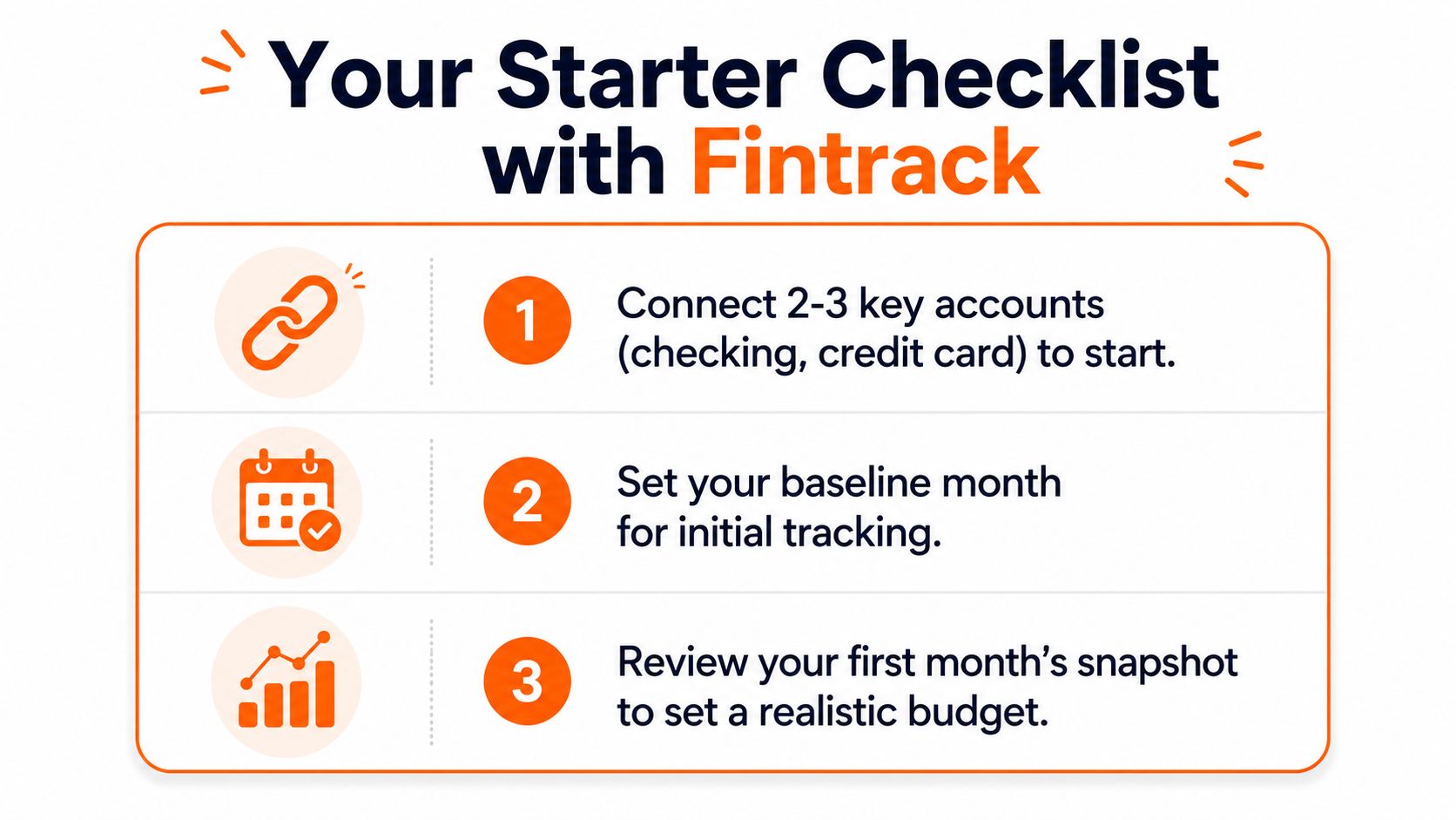
- Add your main accounts first. Start with checking, credit card, and one savings account.
- Pick one baseline month. Use it as your comparison point.
- Track the core KPIs. Watch income, expenses, savings, and net worth.
- Review once a week. Keep it short and consistent.
- Check one goal each month. Make sure the dashboard is helping you move, not just observe.
If you want a simple place to put this into practice, start with Fintrack. It gives you one dashboard for tracking, reviewing, and adjusting your money with less guesswork, which is exactly what a practical personal finance dashboard should do.
If you're ready to turn scattered accounts into one clear view, visit Fintrack and set up your first dashboard with the accounts you already check most often. You'll get a cleaner read on spending, savings, and goals without needing to rebuild your whole money system first.