You check your bank app on a Tuesday night and see groceries jumped from last month. The first question usually isn't “what is inflation?”, it's “did I overspend, or did something normal but annoying happen?” That's where month over month helps, because it gives you a clean comparison between one full month and the one right before it.
Month over month, often shortened to MoM, is one of the simplest ways to read your budget. It works because it answers a very practical question: what changed since last month? If your groceries, fuel, subscriptions, dining out, or utilities moved, MoM helps you spot the change before it turns into a longer pattern.
For a quick way to track those category swings, Fintrack's monthly spending tracker is a useful place to start.
What Month Over Month Actually Means in Daily Life
A MoM check is just a side-by-side look at two neighbouring months. If your grocery bill was lower in March and higher in April, you compare March to April, not April to last spring and not April to the whole year's average.
That short loop matters because it catches fresh changes while they're still easy to explain. A new gym membership, a higher hydro bill, a one-time restaurant week, or a heavier commute can all show up fast in a monthly comparison.
Where MoM feels useful at home
In daily life, MoM works best for categories that change often:
- Groceries, where a stock-up trip can make one month look unusually high.
- Fuel, where commute patterns or price changes show up quickly.
- Utilities, where weather and usage can shift from one bill cycle to the next.
- Subscriptions, where a forgotten renewal can nudge the total upward.
- Dining out, where a busy social month can stand out immediately.
Practical rule: if you want to catch a new habit early, compare this month with the one directly before it.
MoM is faster than waiting for a quarterly review, and less noisy than obsessing over weekly swings. A single week can be distorted by timing, while a full month gives you enough data to see a real pattern without losing the detail you need.
If you want to make those comparisons repeatable, a simple monthly budget template helps keep the numbers in one place, which makes the next step much easier.
The Month Over Month Formula and a Quick Example
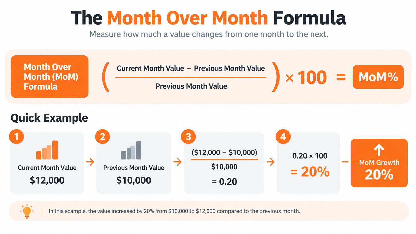
The formula is straightforward:
((This Month minus Last Month) divided by Last Month) multiplied by 100
That tells you the percentage change from one month to the next. The important part is the denominator. Last month sits underneath the fraction because MoM is built to measure change relative to the starting point, not the ending point.
Say groceries were $612 last month and $743 this month.
Subtract the old number from the new one.
$743 - $612 = $131Divide the difference by last month.
$131 ÷ $612 = 0.2138Turn it into a percentage.
0.2138 × 100 = 21.4%
So groceries are up about 21.4% MoM.
Why a seasonal comparison sometimes makes more sense
A raw MoM number can mislead when a category has a regular seasonal pattern. Summer produce, winter heating, holiday travel, and back-to-school buying can all bend the month-to-month picture.
Take gas as a simple example. If you compare one summer month to the one immediately before it, you may be mixing a normal seasonal rise with a real price change. In that case, a year-over-year or seasonally adjusted comparison can tell you more about the underlying pattern.
Keep the currency, the time window, and the category consistent. Once those three match, the percentage will mean something.
For a practical budget layout that makes these comparisons easier to review, Fintrack's monthly budget template gives you a clean starting point.
When Month Over Month Beats Year Over Year
MoM and year over year, or YoY, solve different problems. MoM is the better lens when you need quick feedback inside the same season. YoY is better when you want to know whether something has changed over the long run.
Two common budget questions, two different answers
If you're trying to cut grocery overspend this quarter, MoM is the sharper tool. You want to know whether this month's meal planning, shopping list, or restaurant spending is better than last month's, not whether it beat the number from twelve months ago.
If you're checking whether utilities are still reasonable after a heat pump upgrade, YoY usually makes more sense. Last winter's bill already includes the seasonal cold, so comparing the same month across years strips out a lot of noise and helps you see whether the change is structural.
Short version: use MoM for monthly steering, and YoY for baseline checks.
| Budget Question | Better Lens | Why |
|---|---|---|
| Grocery spending changed after a new meal plan | MoM | It shows fast feedback within the same season |
| Utility costs after a heat pump change | YoY | It compares like with like across seasons |
| A subscription went up this month | MoM | It reveals the new baseline immediately |
| Annual progress on rent, insurance, or a rate change | YoY | It shows whether the cost has really shifted |
The same household can need both lenses in the same year. MoM helps you correct course quickly, while YoY keeps you honest about long-term change.
If you want a broader planning view around those comparisons, Fintrack's financial forecasting guide fits naturally beside this habit.
Reading MoM Numbers in a Personal Budget
A MoM number is only useful if you read the category behind it correctly. A jump in one bucket can mean a one-off event, a recurring cost, or a locked-in change, and those three situations need different responses.
Groceries, subscriptions, and rent do not behave the same way
Groceries can swing because of a holiday week, a pantry stock-up, or a few expensive items at once. If your grocery total rises from $620 to $695, the MoM change is about 12.1%, but the first question is whether you bought more than usual or just bought earlier than usual. Before you cut too hard, check the week-by-week pattern and ask whether the spike is likely to fade.
Subscriptions are different. If a monthly total rises because one forgotten annual charge finally posted, that looks structural on paper but may not continue. The action is usually to confirm whether you still want the service, then decide whether to cancel it.
Rent is the clearest case of a locked-in change. If rent stays flat from one month to the next, that's normal. If it jumps after a lease renewal, the new level usually stays in place until the next negotiation.
| Category | Last Month | This Month | MoM % | Likely Cause | Action |
|---|---|---|---|---|---|
| Groceries | $620 | $695 | 12.1% | Holiday timing, stock-up trip, or higher basket cost | Check the week-by-week split before changing your plan |
| Subscriptions | Monthly total before renewal | Higher monthly total after a charge posts | Higher than usual | Renewal, forgotten service, or annual billing timing | Review the charge and cancel anything you no longer use |
| Rent | Stable monthly payment | Higher monthly payment after renewal | Higher after lease change | New lease terms | Treat it as the new baseline and plan around it |
If you're trying to work out whether a category is manageable or needs a reset, monthly budget optimisation steps can help you separate quick wins from costs that are harder to move.
For a dashboard view that keeps the gap between expected and actual spending visible, Fintrack's budget versus actual view is the kind of check that makes these reads much easier.
Common MoM Interpretation Traps to Avoid
The biggest mistake is assuming every MoM spike is a spending mistake. In reality, some jumps are seasonal, some are timing effects, and some are just the result of comparing the wrong months.
Seasonality, base effects, and calendar timing
Seasonality matters a lot in Canada. Heating bills can jump sharply in cold months, and the pattern is tied to weather, not just behaviour. A higher winter bill doesn't automatically mean the household got worse at budgeting, it may just mean the furnace worked harder.
Base effects can also distort the picture. If last month included a refund, a cashback payout, or a skipped bill, the next month can look inflated even when spending is normal. The current month is not always “too high”, sometimes the prior month was artificially low.
Calendar timing causes another common mistake. A five-week grocery cycle, a bill that lands on the 1st instead of the 31st, or a payment that shifts across month-end can move the number without changing the habit.
Statistics Canada says the Consumer Price Index is published monthly, and it's more accurate over several months or a year than from one month to the next because most prices are collected once per reference month, usually in the first two weeks of the month (Statistics Canada CPI survey description). That's a good reminder that a single month can be informative, but it should still be read with care.
What happened last month that didn't happen this month?
That one question filters out a lot of false alarms.
Visualising Month Over Month Trends Clearly
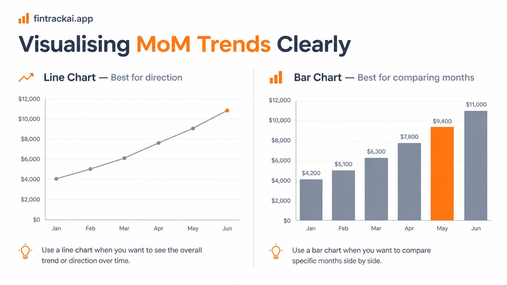
A good chart turns MoM from a number into a pattern you can read. The right chart depends on whether you want direction, comparison, or composition.
Choose the chart that matches the question
A line chart works best when you want to see the slope. Put months on the x-axis and dollars on the y-axis, and you'll spot whether spending is drifting up, flattening out, or bouncing around. If you overlay a short moving average, the one-off spike becomes easier to separate from a genuine trend.
A bar chart is better when you want to compare the size of a category across months. It makes differences easy to see, but it doesn't show direction as naturally as a line.
Stacked bars are useful when you want to understand total spending composition, not just one category. Small-multiples help when you want to scan several categories side by side and find the one that breaks the pattern.
For a quick monthly review, pair the chart with a small percentage-change strip underneath. That way, you see the raw dollars and the MoM story at the same time.
The clearest dashboards don't try to show everything at once. They show just enough to answer one question well.
For a broader read on how patterns, direction, and repeated changes fit together, Fintrack's trend analysis guide is a useful companion.
A Simple MoM Review Habit and How Fintrack Helps
A monthly check-in does not need to take long. If you keep it to one short routine, you're more likely to keep doing it, and that matters more than making it perfect.
A five-step habit that stays manageable
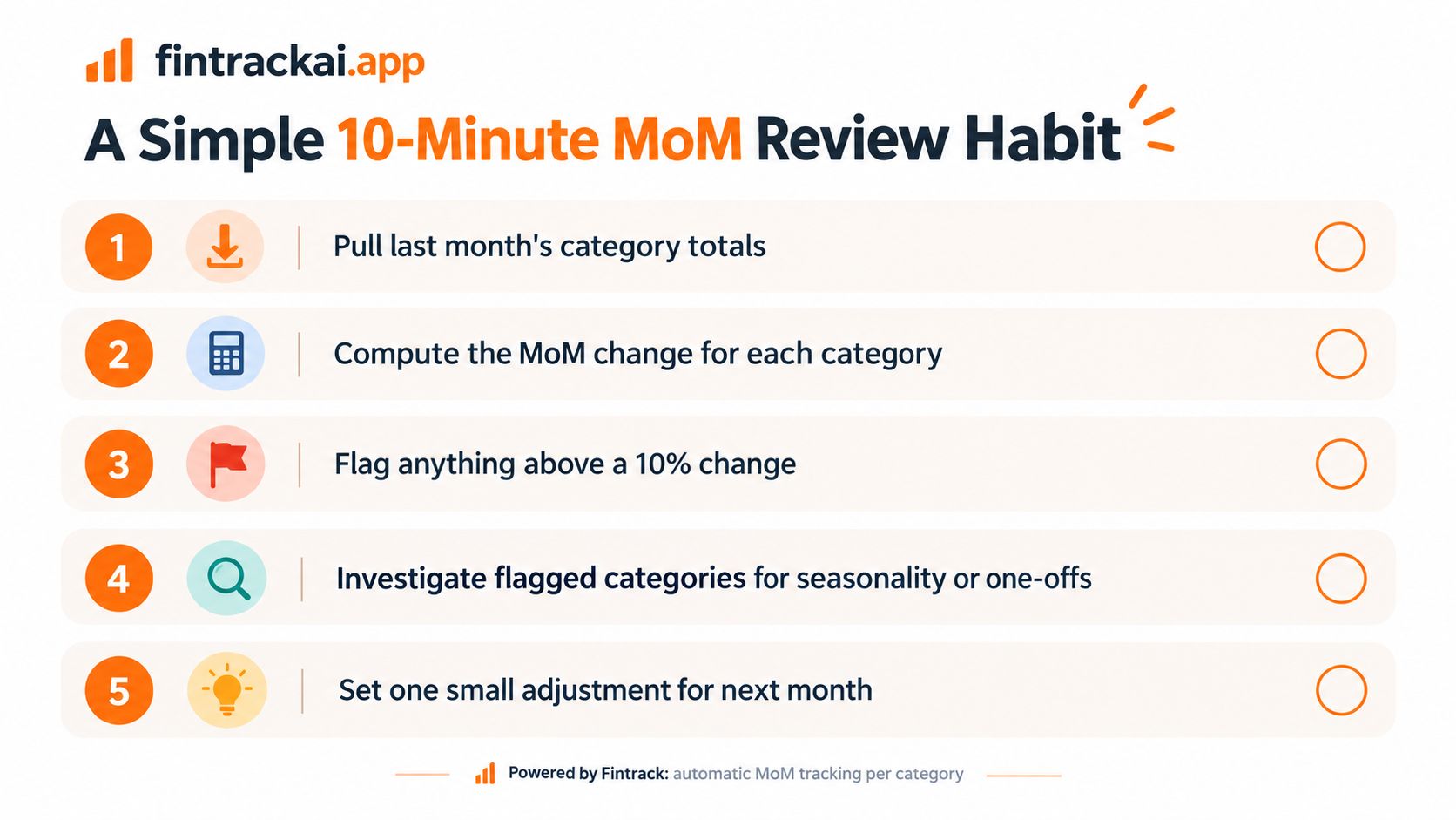
Pull last month's category totals.
Start with groceries, transport, utilities, subscriptions, and any category that tends to move.Compute the MoM change.
Compare each category with the month before it and note the percentage shift.Flag anything that jumps.
Use a simple threshold, then focus on the categories that really moved.Decide what caused the change.
Sort each spike into one of three buckets, structural, seasonal, or discretionary.Set one adjustment for next month.
Change one behaviour, one limit, or one reminder so the next review has a better starting point.
A tool like Fintrack can handle the repetitive parts, including category roll-ups, monthly comparisons, spending alerts, and note-taking around unusual charges. That leaves you with the part that matters most, which is deciding what the number means.
Practical rule: one monthly decision is better than five vague intentions.
That's the value of MoM. It turns “something feels off” into a clear check, a clear reason, and one next action.
If you want a simple way to keep those month-over-month comparisons visible without spreadsheets, take a look at Fintrack. It can help you review category changes, spot unusual swings, and keep your monthly budget checks organised in one place.